Multi-pickup Point
Multi-pickup Point
This project is a feature that allows customers to buy a product and pick which location they want it to pick up or deliver from. It's a feature improvement to existing delivery and pickup experience at Blibli.
This project is a feature that allows customers to buy a product and pick which location they want it to pick up or deliver from. It's a feature improvement to existing delivery and pickup experience at Blibli.
My tasks were to assess the impact on customer experience and provide solutions for affected squads. I created interactive prototypes, both low and high-fidelity, for user testing and discussion with Blibli's internal team. In detail, I am responsible for the new store listing modal, end-to-end flow for product display page, search result page, and seller page.
My tasks were to assess the impact on customer experience and provide solutions for affected squads. I created interactive prototypes, both low and high-fidelity, for user testing and discussion with Blibli's internal team. In detail, I am responsible for the new store listing modal, end-to-end flow for product display page, search result page, and seller page.
Years
Years
2022
2022
My role
My role
Senior product designer
Senior product designer
Before (left) and after (right) comparison after redesign.
Before (left) and after (right) comparison after redesign.
Purpose and project goals
Purpose and project goals
Blibli had two separate buttons for each fulfilment at the product display page, one for delivery and the other for pickup in store. During the discussion between designers, we’re not sure if combining both journeys would have a negative impact on the user.
Blibli had two separate buttons for each fulfilment at the product display page, one for delivery and the other for pickup in store. During the discussion between designers, we’re not sure if combining both journeys would have a negative impact on the user.
I collaborate with UX researchers to test this assumption using A/B testing and qualitative surveys. I had the following goals in mind when I started:
I collaborate with UX researchers to test this assumption using A/B testing and qualitative surveys. I had the following goals in mind when I started:
Increase awareness about pickup in store for online users.
Seamless user interface — Cater to all users’ need for delivery and pickup in store.
Increase awareness about pickup in store for online users.
Seamless user interface — Cater to all users’ need for delivery and pickup in store.
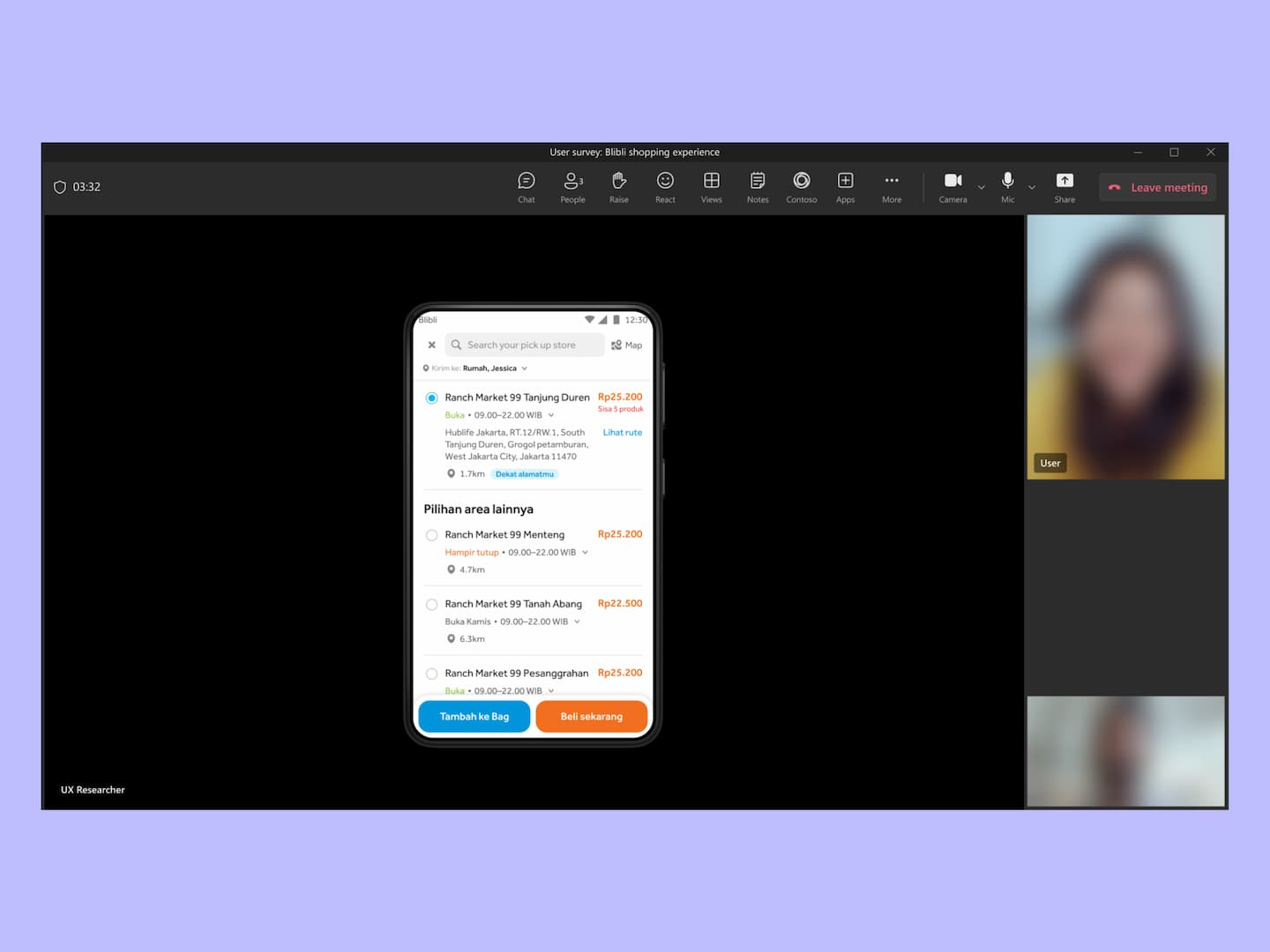
Screen simulated. We conducted qualitative survey using Microsoft Teams and user interact with Figma prototype.
Screen simulated. We conducted qualitative survey using Microsoft Teams and user interact with Figma prototype.
Users’ insight during qualitative remote surveys
Users’ insight during qualitative remote surveys
During the discussions between designers, we came up with a layout to combine both journeys together. We were not sure if it’s intuitive for existing users, so we plan to test our hypothesis with an interactive prototype for A/B testing. We also conduct qualitative surveys to gain more insight about our pickup in store option.
During the discussions between designers, we came up with a layout to combine both journeys together. We were not sure if it’s intuitive for existing users, so we plan to test our hypothesis with an interactive prototype for A/B testing. We also conduct qualitative surveys to gain more insight about our pickup in store option.
I discovered some great feedback from surveys such as:
I discovered some great feedback from surveys such as:
Users are familiar with the Click and Collect logo, and it helps to raise awareness of the new feature.
Show alternative shipping methods like Instant or Same day to have a sense of shipping selection.
Users find the radio button solution is much more intuitive because it gives them explicit actions.
We then go forward with these design choices and continue to improve it.
We then go forward with these design choices and continue to improve it.
Screen variations at product detail page.
Screen variations at product detail page.
Onboarding at product detail page.
Onboarding at product detail page.
Dynamic seller location section
Dynamic seller location section
Seller store locations get improved and consolidated with the addition of new ship-only locations. I make sure, from an information architecture standpoint, to cater to users’ needs.
Seller store locations get improved and consolidated with the addition of new ship-only locations. I make sure, from an information architecture standpoint, to cater to users’ needs.
Product card information on search results is also reflected based on users’ intention. It shows relevant information based on the user’s preferred shipping from selected filters or entry points.
Product card information on search results is also reflected based on users’ intention. It shows relevant information based on the user’s preferred shipping from selected filters or entry points.
Contextual CTA & improved store listing
Contextual CTA & improved store listing
Blibli had dedicated pages to display pickup in store products only. Whenever users are in that page, by default it will show ‘Pickup in store’ on the CTA button. But users have the control to change it to shipping at any time. But, if it’s not a dedicated pickup in store page, then by default it will prioritise delivery.
Blibli had dedicated pages to display pickup in store products only. Whenever users are in that page, by default it will show ‘Pickup in store’ on the CTA button. But users have the control to change it to shipping at any time. But, if it’s not a dedicated pickup in store page, then by default it will prioritise delivery.
I explore iterations on store listing modals with a one-size-fits-all approach. But once tested with the users, there’s information deemed irrelevant on different flows. I discussed it with the project manager and lead dev about a dynamic approach instead, and they agreed after weighing the options.
I explore iterations on store listing modals with a one-size-fits-all approach. But once tested with the users, there’s information deemed irrelevant on different flows. I discussed it with the project manager and lead dev about a dynamic approach instead, and they agreed after weighing the options.
The store listing modal adapts its displayed information to user intentions. If the user’s entry point starts from the search result, then we show two CTA buttons for add to cart and buy now.
The store listing modal adapts its displayed information to user intentions. If the user’s entry point starts from the search result, then we show two CTA buttons for add to cart and buy now.
I also added micro-interactions on the listing to reduce user cognitive load when skimming the list. Once the user selects a store, it will display detailed information about that store location.
I also added micro-interactions on the listing to reduce user cognitive load when skimming the list. Once the user selects a store, it will display detailed information about that store location.
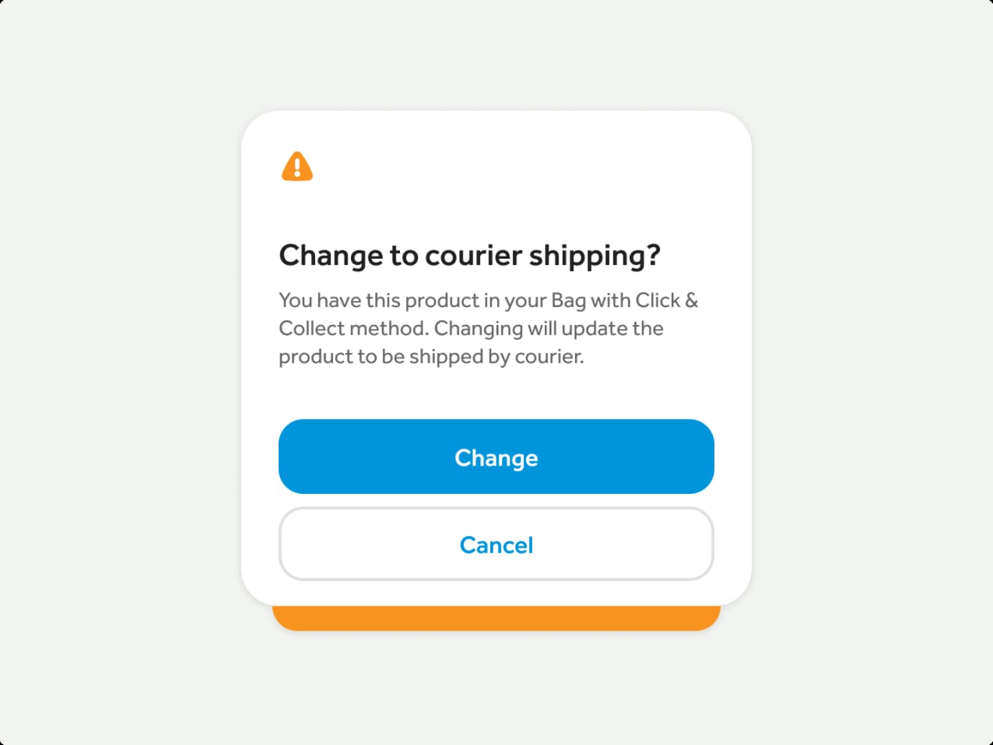
Change of mind prompt
Change of mind prompt
Additionally, there’s a dialog prompt after adding to cart and the system detects that it has different shipping methods in their cart. The prompt will ask if users want to change their existing fulfilment into pickup in store or courier shipping. I discussed it with the cart UX representative so it’s in line with cart behaviour and to make Blibli's experience consistent.
Additionally, there’s a dialog prompt after adding to cart and the system detects that it has different shipping methods in their cart. The prompt will ask if users want to change their existing fulfilment into pickup in store or courier shipping. I discussed it with the cart UX representative so it’s in line with cart behaviour and to make Blibli's experience consistent.
New map view across platform
New map view across platform
I simplified the map listing with a list view on the side, updated its interaction, and made sure they’re accessible to all users. Users are able to choose a seller’s location using map view from both desktop and mobile. With a simple toggle, on desktop it will expand the list view with map view on the side. They can discover new stores by searching the area on a map.
I simplified the map listing with a list view on the side, updated its interaction, and made sure they’re accessible to all users. Users are able to choose a seller’s location using map view from both desktop and mobile. With a simple toggle, on desktop it will expand the list view with map view on the side. They can discover new stores by searching the area on a map.
Conclusion
Conclusion
It was my third big cross-collaboration project to align with many squads and cross-functional teams. The project took around six months, from brainstorming, development, to going live. With a project as big as this, we've pivoted some proposed features to different designs because they were costly to develop.
It was my third big cross-collaboration project to align with many squads and cross-functional teams. The project took around six months, from brainstorming, development, to going live. With a project as big as this, we've pivoted some proposed features to different designs because they were costly to develop.
The process showed me how to convey ideas across disciplines in Figma and documents. Halfway through the process, I learned to document incoming feedback and its response on a single source of truth. Capturing key queries during decision-making facilitated cross-team communication and resolved overlaps.
The process showed me how to convey ideas across disciplines in Figma and documents. Halfway through the process, I learned to document incoming feedback and its response on a single source of truth. Capturing key queries during decision-making facilitated cross-team communication and resolved overlaps.
With help from others, I’ve achieved alignment with 7 different tribes, 5 groups of developers, and 3 project managers. As of September 2023, the time of writing, Blibli were still enhancing the project.
With help from others, I’ve achieved alignment with 7 different tribes, 5 groups of developers, and 3 project managers. As of September 2023, the time of writing, Blibli were still enhancing the project.
Let's work together.
If you think I'd be a good fit for your team or project, feel free to reach out.
© 2026 Adrianus Hariesta
Let's work together.
If you think I'd be a good fit for your team or project, feel free to reach out.
© 2026 Adrianus Hariesta
Let's work together.
If you think I'd be a good fit for your team or project, feel free to reach out.
© 2026 Adrianus Hariesta
Let's work together.
If you think I'd be a good fit for your team or project, feel free to reach out.
© 2026 Adrianus Hariesta